Keep your pantones on.

This week at VOMP Studios - Got my mom in town this week looking at homes in Austin. Already convinced one brother to move here and now maybe my parents. Who’s next?!
This week’s riffs for the creative vandals, outlaws, misfits, and pirates of the internet:
Create Cooler: How to give your brand an edge with specific pantones
Build Better: The best tool I’ve found for digital color combos
Earn Easier: The push and pull of a landing page
Break The Rules: Lego’s kicks game is just rude
The Hit List: Music to turn up and tune out


The Color War We Never Knew Existed
Do you know what really started WWII? The color blue.
Not really but it’s definitely started some office tiffs.
Ever wonder how many heated debates happen between designers and printers over the perfect shade of blue? No?
Well, it’s probably enough to fuel a daytime soap opera.
Picture this: the designer says, "I want that stormy ocean blue" and the printer nods, only to print something that looks more like a hungover cookie monster eating a fist full of rotten blueberries.
So, they go back and forth, round after round, until—FINALLY—the blue on paper matches the designer's dream blue.
It's the creative version of tug-of-war for the designer but it feels more like voluntarily putting your hand under a stapler held by a giddy toddler.
Now, we have about a bazillion colors at our fingertips, but we still can't quite agree on how to describe them.
“Oh, it's kinda like the sky but, you know, warmer?” Sure, that's helpful.
For graphic designers, it's like walking a tightrope.
A client points to a passing cop car and says, "I want that exact blue for my logo."
But hey, is your idea of "life-saving blue" the same as mine? We’re living in a world where something as vague as “heavy” could mean you’re lifting a bag of flour or a car engine.
So, how the fuck are we supposed to nail down color?
Cue the hero of this story: Pantone.
What In The World Is Pantone?
Before Pantone swooped in, every printer was doing their own thing.
One company’s yellow was a gentle daffodil and another’s yellow was, well, a screaming highlighter. Consistency? GTFO.
Designers would end up pulling their hair out, and clients would be left wondering why their "happy yellow" poster looked like a puppy training mistake.
Then came 1963, when Pantone (translation: “all the colors”) decided enough was enough.
They gave us the first-ever color-matching system - an actual way for designers to see what a color looks like in the real world before it's printed.
Want that perfect banana yellow? Now, you just give the printer a Pantone number, and boom, no guesswork.
Keep Your Pantones On
For the first time in forever, designers, printers, ink makers, and clients all got on the same page.
You want “green”? Done. The designer says it, the printer orders it, and the client actually gets it.
The circle of life—no surprises, no awkward “ummm, that’s not what I had in mind” moments.
And for brands? This was basically the holy grail.
Suddenly, every company could have the same exact color across everything from tiny business cards to massive blimps.
No more “close enough.” It was spot-on color matching, anywhere in the world.
Talk about a game-changer.
Pantone is now the undisputed boss of color.
Their system runs the show, making sure that wherever you are, whatever you're printing, you get the color you need—no tears, no tantrums.


Because Ugly Colors Won’t Sell Your Shit
Is a picture still worth a thousand words if its color scheme looks like a bad trip? Spoiler alert: No.
May or may not be speaking from experience here.
We all know that infographics, charts, and even GIFs can capture eyeballs—but slap some neon green next to khaki and people are going to click away faster than you can say "well that didn’t work."
Let’s talk color theory.
Yeah, it sounds nerdy, but it’s the secret sauce to making sure your creative doesn’t look like a clown threw up on them after shotgunning an original formula Four-Loko.
What Exactly is Color Theory?
First off, what it’s not: color theory isn’t some rigid, dusty rulebook.
You’re not going to get arrested by the Design Police if you break a rule here or there.
But knowing the basics—what we’ll call “traditional color theory”—gives you a solid foundation.
It’s like the red-yellow-blue model you vaguely remember from school, but we’re gonna make it way cooler (promise).
Quick history flex: Aristotle was dabbling in color theory back in 330 BCE.
Ibn al-Haytham, the father of modern optics (gangster title, right?), added his two cents in the 9th century.
Now, here we are, using this ancient knowledge to decide if your landing page should be baby blue or blood red.
So why give a shit about this?
Because using color theory is the secret weapon to getting people to feel something when they see your content.
And feelings sell.
You want them to feel excited, calm, hungry? (Hey, red gets people hungry. Science.)
Why Does Color Theory Matter in Web Design?
Color isn’t just decoration; it’s a power move.
It can subtly (or not-so-subtly) change how your visitors move through your website, react to your text, and decide whether or not they’ll stick around long enough to buy something.
With a little color savvy, you can basically Jedi mind-trick people into clicking on what you want.
It doesn’t matter if you’ve never won “Most Artistic” in school.
These days, there are a zillion tools to help even the most design-challenged marketers create something that looks like it wasn’t thrown together in 10 minutes.
But choosing the right color combo?
That’s where the real challenge lies.
Staring at a color wheel can feel like trying to read a foreign language without Google Translate.
… Or like me trying to drive in Barcelona a few years back (Basically going nowhere fast. In kilometers per hour too so it’s all a disaster.)
Brands have been sneaking color psychology into marketing forever.
McDonald's? Bright red and yellow.
Why? Because those colors make you feel hungry and happy.
Coincidence? Not a chance.
How Colors Work Together (and Why You Should Care)
Here’s the deal: colors aren’t just a “looks pretty” thing.
They can create a vibe, set a mood, and change how people perceive your brand.
Want visitors to feel like they can trust your brand? Blues and greens are your friends.
Want them to feel energized and click that CTA button? Bring in some orange or red.
But, uh, don’t just start smashing colors together like a kid with finger paints after a 2nd bowl of ice cream.
You need to think about how colors work together.
Otherwise, you’ll end up with a hot mess on your website that screams "I have no idea what I’m doing."
The Power of the Right Color Choice
Want your website to pop? Get your CTAs clicked? Maybe even make more sales?
The right colors can make specific sections of your website shine, guide users through your site like a well-lit runway, or give them a cozy feeling of "Yeah, I can trust these guys."
It’s not enough to just throw random colors together and hope it works out.
You’ve gotta understand color theories, vibes, HTML color codes (fun, right?), and what makes your site accessible to all users.
Get it wrong, and your design’s gonna flop. Get it right, and you’ll look like a marketing genius.
Wanna look like a genius?
This is my favorite color-matching tool on the whole interwebs


Read The Door
There’s no shortage of awkward, everyday human fails.
We’ve all been there.
But nothing… and I mean nothing… quite hits like pushing a pull door in front of your squad. It's the ultimate public humiliation.
And while that’s got zero to do with landing pages, I had to bring it up.
Because, let’s be honest, we’re all friends here, right? RIGHT!?
So let’s dive into landing pages.
Stop Screwing This Up
Look, there are tons of so-called “perfect” landing page templates out there.
I could insert a rant about this, but let’s be real: the word “perfect” makes my skin crawl.
Every time I hear someone call their online template “perfect,” I wanna jab a jagged fingernail right into their cornea.
They’re more full of it than Clinton telling the coutry he didn’t have relations with that girl
Newsflash: Nothing online is “perfect” unless you’re converting at 100% WITH statistically significant data to back it.
And let’s be honest, nobody’s doing that. If you are, call NASA because you’ve just broken the internet. Good for you, Zuck.
That said, there are strategies rooted in actual persuasion techniques that have a pretty damn solid track record.
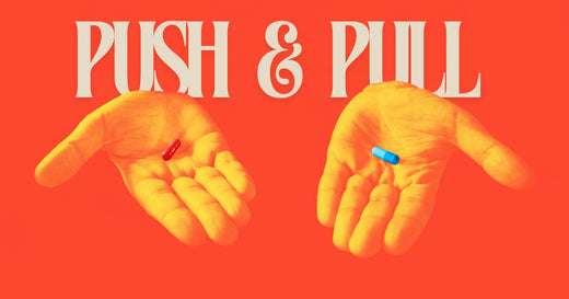
The Push and the Pull (No, Not That Push)
No, I’m not talking about the infamous 2005 Bush Push (USC vs. Notre Dame fans, you know).
I’m talking about the push and pull strategy for your landing pages. Here’s how it works:
Push:
This is where you push out educational info.
You’re flexing your knowledge, showing your visitors why they should care about your product. You’re making them think, “Wow, this person knows their shit.”
Pull:
Now it’s time to reel them in.
This is where you drop your call-to-action (CTA) and pull them toward doing something—buying, subscribing, signing up—whatever gets you closer to that sweet “cha-ching!” sound on your phone.
The magic trick? You need to alternate between these two.
Think of it like a first date (without the cringe small talk).
You share a little about yourself, then ask a question. Give and take. Show and ask.
Too much "show," and you’re the guy who won’t stop talking about his ex (yikes).
Too much "ask," and you’re the needy one who’s already planning the wedding after date one.
Keep the Flow Going
Alternating your push and pull sections keeps your landing page flowing smoothly.
The longer a visitor stays on your page, the more likely they are to convert.
It’s like keeping the conversation going on a date—you don’t want awkward silences, but you also don’t wanna scare them off by asking if they want kids right away.
And if you think this might also be good dating advice, I’m not saying it’s not…
But maybe don’t tell them you learned it from a landing page riff.


The Collab You Didn’t Know You Needed (But Now You Kinda Do)
On August 22, LEGO and Nike announced the ultimate crossover we didn’t see coming: a multiyear partnership bringing together the world’s biggest sportswear giant and everyone’s favorite brick-building empire.
*I said bricks, not logs. Because nobody can knock Lincoln Logs off that throne.
This comes after years of fans already mashing the two up in their own DIY, let’s-see-if-it-works way.
Just take a scroll through the LEGO Ideas site where crafty brickheads pitch new kits and you'll see plenty of folks already dreaming up Nike and Jordan-themed sets.
People really want these two brands to merge, and honestly, it’s about time.
I’ve never been a Lego person (unless I’m dishing a “go step on a Lego in a dark room” dig to a buddy).
Hold Your J’s Though
Hold onto your Air Force 1s though as this partnership might not be exactly what you’ve been envisioning.
“We’re pumped to team up with Nike and reimagine how play and sport collide,” said Alero Akuya, VP of Brand Development at LEGO, in an official statement.
“Together, we’re going to cook up some fresh experiences to fire up kids’ imaginations.”
Translation: This isn’t just about shoes; it’s about play on a whole new level.
Nike’s Cal Dowers, VP of Global Kids at Nike, threw in his two cents, saying, “At Nike, we know the future of sport starts with kids. And now, teaming up with LEGO, we’re all-in on creating a new vision of sport and creativity for the next generation.”
Basically, if your kid’s not already hooked on LEGO or sneakers, this will seal the deal.
Do It For The Kids
So, yeah, this collab? It’s for the kids.
If you were holding out for an Air Jordan LEGO kit to grace your coffee table, don’t start clearing space just yet.
Starting in 2025, LEGO and Nike are planning to roll out a mix of co-branded products, content, and experiences.
It’s all still vague, but let’s be real—don’t hold your breath for buildable Air Max kits just yet.
The vibe is more “let’s get kids excited about play” than “here’s your limited-edition sneaker in brick form.”
According to their joint statement, this partnership is all about "championing kids' right to play."
LEGO x Nike is less about sneakerheads geeking out over LEGO kicks and more about tapping into the joy of play for the next generation.
Think LEGO x Mario, which started off kid-friendly but eventually got more hardcore for the diehard fans.
Either way, it’s a big win for LEGO, who’s been on a tear lately with collaborations.
Remember that Pharrell biopic? Yeah, it's gonna be built entirely with LEGO bricks. Talk about leveling up.
And if you’re wondering, “Didn’t LEGO already team up with a sneaker brand before?”—you’re right.
Back in 2021, LEGO hooked up with Nike’s rival, Adidas, dropping sportswear and even buildable shoe kits. But this? This is a whole new ball game.
So, while your dream of building your favorite kicks in LEGO form might be on hold, there’s plenty of fun on the way.
Stay tuned, and maybe clear a little shelf space just in case.
I am.


Different creative pursuits call for different music to jam to. Here’s what I jammed to this week on The Vomp Playlist:

TE AMO ❤️
Three phrases have changed my life more than any others:
Thank you
I appreciate you
I love you
Te amo is Spanish for “I love you.” It’s also the most beautiful-sounding phrase in any language I’ve had the pleasure of experiencing. It just flows right off the tongue.
I mean all 3 to you as you read this.
Thanks for giving it your attention and your most valuable resource - your time.
I appreciate you. Te amo.
Ride the lightning,
Luke Bockenstette